
Norwegian Cruise Lines Product
Card Redesign
Reimagining the excursion booking experience on Norwegian Cruise Line's app — making it more visual, concise, and accessible across a wide age range of travelers.
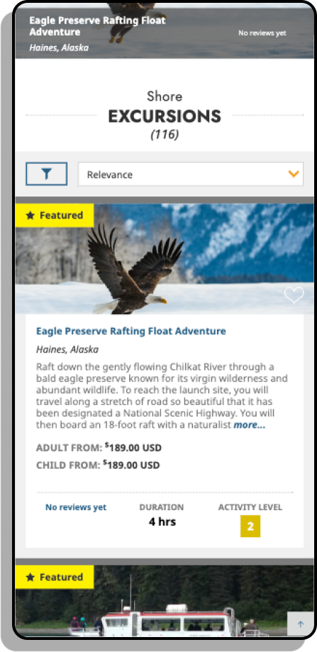
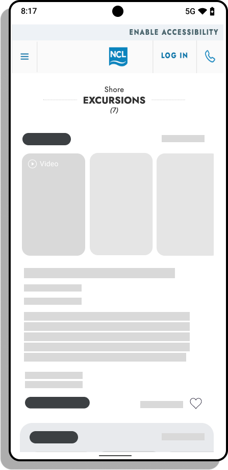
Previous UI
My Role
UX Designer
Company/Team
Norwegian Cruise Lines
Team
One UX Designer
Tools
Figma
Adobe Creative Suite
The Challenge & Business Context
Norwegian Cruise Line has pioneered flexible cruising for over 56 years, serving guests across more than 450 destinations worldwide. As users increasingly shifted to booking excursions on the go via the NCL app, the existing excursion card UI — heavy on text, light on visuals — began showing its age. The challenge: redesign the product card to better serve a mobile-first audience spanning multiple generations.
User Pain Points

⨀ Text-heavy cards overwhelm users on mobile. The original excursion cards leaned heavily on written descriptions at a time when research shows less than 20% of web page text is actually read. On mobile — where NCL users are most active — dense copy creates decision fatigue, especially for older users like Charles and Janice who are already less comfortable navigating technology.
⨀ No visual preview before committing to an excursion. Users had no immediate way to see what an excursion looked or felt like without reading through it first. For a product that's fundamentally experiential — a snorkeling trip, a city tour, a culinary experience — the absence of rich imagery or video forced users to rely on imagination, which raises hesitation and lowers booking confidence.
⨀ One-size-fits-all design ignores a wide age spectrum. NCL's passenger base spans from tech-savvy 25-year-olds to 60-year-olds who may rarely use apps. The original design didn't account for this range — it was neither engaging enough for younger users nor simple enough for older ones. Without clear visual hierarchy and scannable content, the experience likely felt cluttered to some and unfamiliar to others, increasing drop-off on both ends.
Research & Insights
A competitive analysis of cruise lines targeting a similar demographic — couples aged 25–60, honeymooners, and families — revealed a consistent trend toward image-forward, scannable booking experiences. Cognitive research reinforced the design direction:
90% of information processed by the brain is visual, and images are processed 60,000x faster than text.
People remember 65% of what they see vs. only 10% of what they hear.
Nielsen's eye-tracking research found that less than 20% of text on a web page is actually read.
Publishers using visual content grow traffic 12x faster than text-heavy counterparts.
These findings pointed to a clear opportunity: the original card design was too verbose for the way users actually process information on mobile — especially on the go.
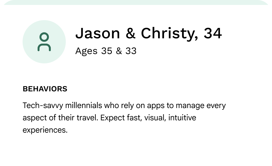
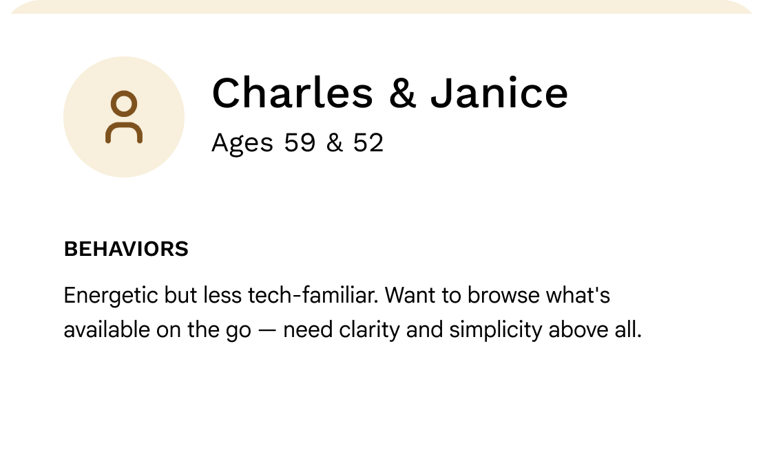
Testing Personas
Design Solutions
What we built and why
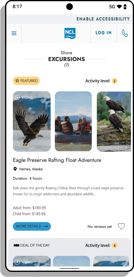
The redesigned excursion card introduced four core changes. An image carousel leads the experience, giving users an immediate visual sense of each excursion without reading a line of copy. A video card — expandable to full-screen — lets users who want more depth explore at their own pace, borrowing familiar patterns from other immersive media apps. Card copy was significantly condensed, replacing lengthy descriptions with concise, scannable text paired with imagery. Finally, an AI-curated insight card surfaces distilled highlights from past user reviews, helping users make confident booking decisions quickly.
What shipped
Scrollable image carousel
A vivid, scrollable image carousel surfaces at the top of each excursion card — giving users an immediate visual sense of the experience.

Expandable video card
A dedicated video card allows users to explore excursion offerings in depth. Tapping expands into a full-screen immersive view, consistent with patterns users already know from other media apps.
Condensed, scannable copy
Verbose descriptions were reduced in favor of concise, high-signal text, which aligned with research showing users engage significantly more with short messaging paired with imagery.
AI-curated review insights
An additional card surface surfaces distilled insights and recommendations drawn from past user reviews, curated via AI — helping users make confident booking decisions without parsing every review manually.
Reflections
The central challenge of this project wasn't just visual polish, it was finding a design language that felt modern and engaging to a millennial user without becoming opaque or overwhelming for someone less comfortable with technology. Leaning into imagery as the primary communication layer, and keeping interactions familiar, bridged that gap without requiring two separate experiences.