
Click to Cancel
Redesigning Google Play's subscription cancellation to meet FTC compliance standards while reducing friction and supporting voluntary retention.
The Challenge & Business Context
Cancellation is a pivotal moment in a subscription lifecycle where users expect transparency and ease. The existing Google Play cancel flow forced users through an unskippable survey and an occasional pause screen before reaching confirmation. With the FTC's 2024 "Click-to-Cancel" Rule taking effect, this design no longer met compliance standards for easy termination. Beyond legal risk, the flow eroded trust. Users who encountered unnecessary steps grew frustrated, and that friction didn't retain them — it just delayed the inevitable while damaging brand perception.
How can we help end-users and developers alike not only by ensuring the cancel flow is easy to complete, but also by using the cancel flow as an opportunity to help retain subscribers and reduce voluntary churn.
My Role
UX Designer
Company/Team
Google — Monetization, Apps + Growth
Project Length
4 months
Collaborators
Product Manager
Software Engineer (DevOps)
UX Copywriter
UX Researcher
Design Direction
Google Material 3 Design System
Contraints
Legal regulatory risk
Why did the cancellation flow carry regulatory risk?
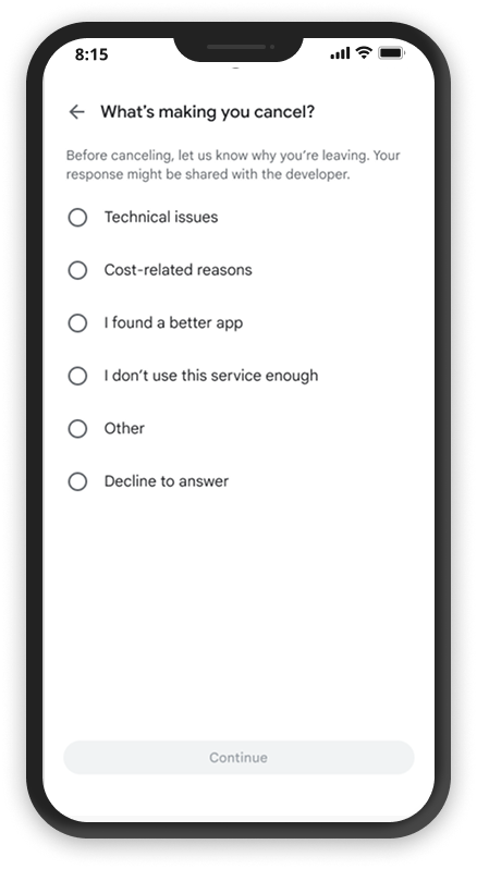
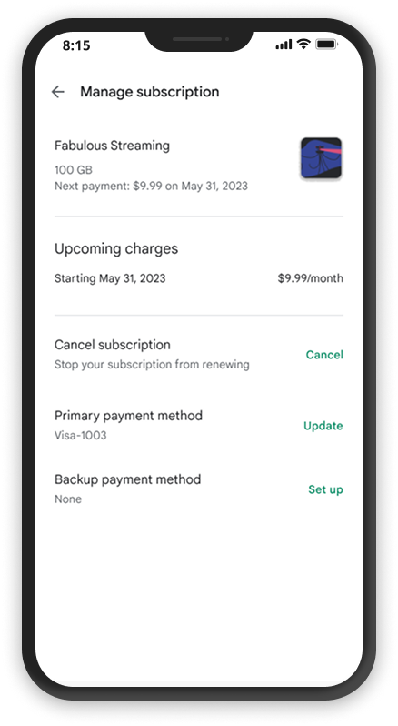
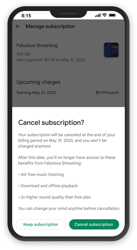
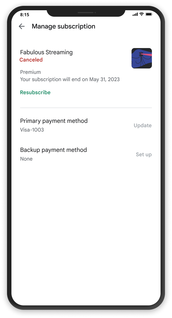
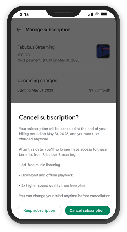
The cancellation process forced users through an unskippable survey and occasional pause screen before allowing them to cancel. With the FTC’s 2024 “Click-to-Cancel” Rule now in effect, this flow no longer met compliance standards for easy subscription termination.
Research & Insights
Past research identified four primary motivations driving subscription cancellations, each pointing to a different user need. These findings shaped how the redesigned flow framed benefit reminders and copy.
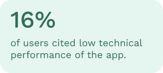
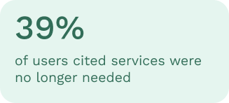
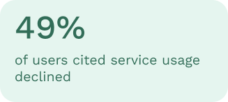
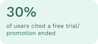
Comparative usability testing placed the original flow against the new frictionless design in front of real users. Three core insights emerged:
Users expected cancellation to complete in 1–2 steps — anything more felt punitive.
Clearly displaying cancellation terms and plan benefits built trust rather than resentment.
While some users found benefit reminders redundant, most appreciated a gentle nudge before confirming — as long as it wasn't blocking their exit.
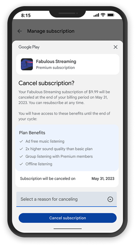
We put the current flow alongside the new frictionless flow in front of users to get feedback.
Key findings
⨀ Users expected a quick and simple cancellation process, ideally completed within 1–2 steps.
⨀ The clear display of cancellation terms and a concise list of plan benefits helped build trust and transparency.
⨀ Although some users viewed the benefit reminders as redundant, most appreciated the gentle nudge to reconsider before confirming cancellation.
Results & Impact
Where the project landed
What shipped
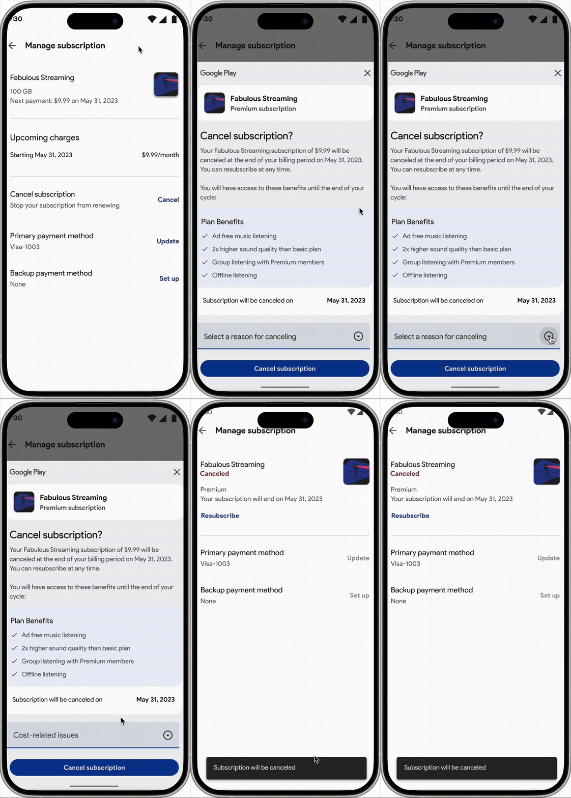
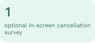
The redesigned flow introduced an optional in-screen cancellation survey, where users can bypass it entirely and cancel immediately. A distinct app icon anchors the experience, and enhanced plan benefit visibility ensures users understand what they're forfeiting before confirming.
Shipped within a 4-month timeline
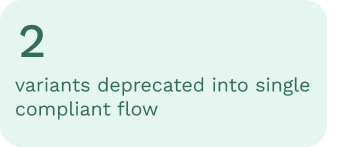
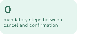
The redesigned flow meets the 2024 "Click-to-Cancel" rule by removing all mandatory survey gates — users can reach cancellation confirmation in a single tap from the cancel entry point.

Optional survey, not a barrier
Cancellation reason feedback is now offered inline and skippable. Users who want to share context can — those who don't are never blocked. Developer churn signal data is preserved without friction cost.
Transparent benefit display
A clear summary of plan benefits surfaces before confirmation — giving users enough context to reconsider without using dark patterns. Paired with a distinct app icon so users always know which subscription they're canceling.
Pause intervention deprecated
The pause bottom sheet variant — which introduced an additional non-compliant step — was fully removed and standardized into the new streamlined path, reducing engineering maintenance overhead alongside regulatory risk.
Reflections
What this project reinforced
Compliance and good UX are not in conflict — a flow that respects users' intent to leave builds more lasting trust than one that obstructs it. The real design challenge was surfacing the right information at the right moment: clear enough to inform, brief enough not to frustrate. Working cross-functionally with legal, PM, research, and copy was essential to threading that needle.