
UXI Infrastructure Redesign
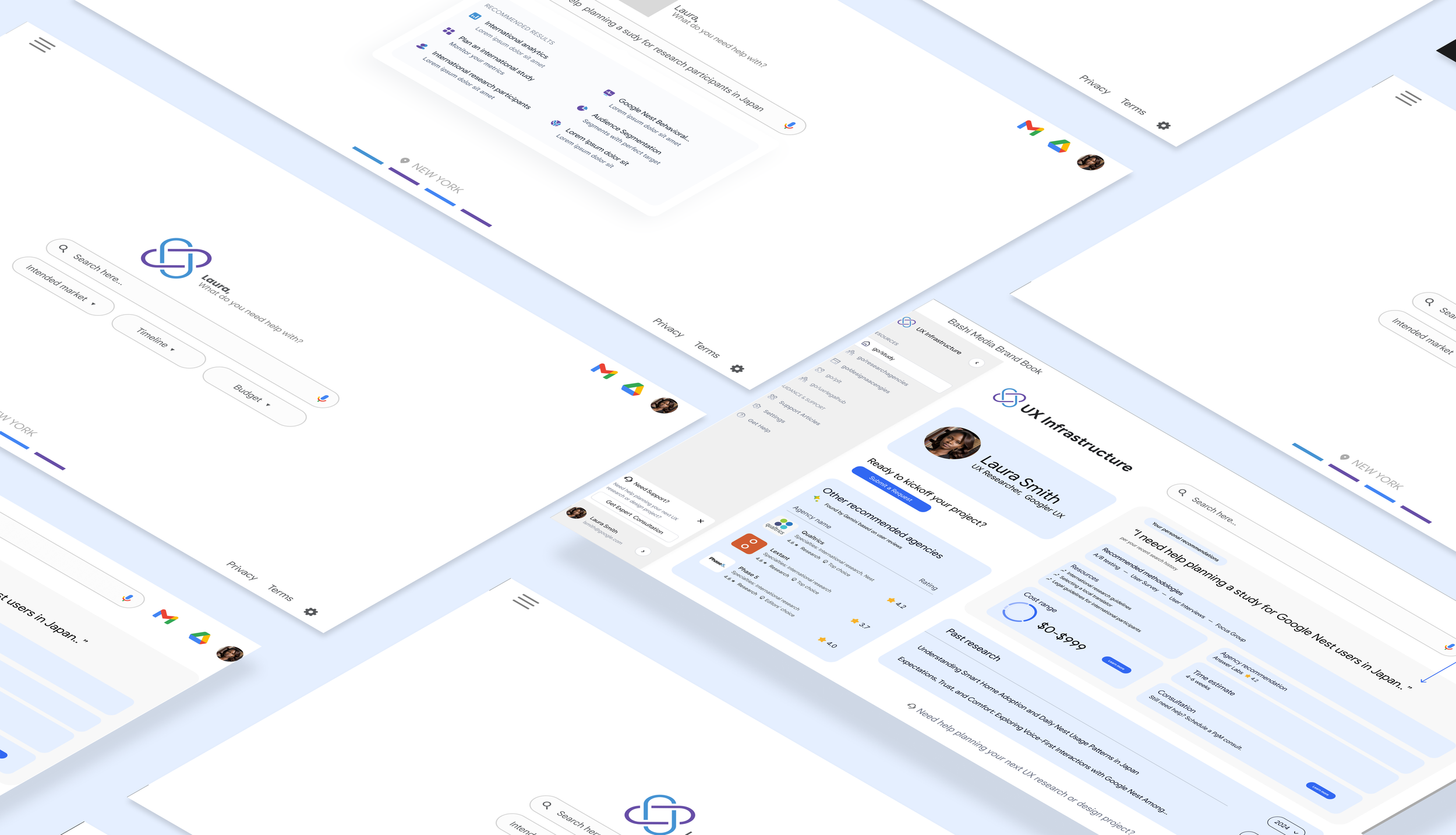
The purpose of this redesign was to revamp the existing Google UX Infrastructure website/platform to improve UXI service discoverability for a higher quality experience and faster decision making.
My Role
UX & Service Designer
Company/Team
Google — UX Infrastructure
Project Length
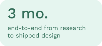
3 months
Collaborators
Product Manager
Software Engineer (DevOps)
UX Researcher
Design Direction
Google Material 3 Design System
The Challenge & Business Context
Google UX Infrastructure (UXI) operated as an internal service organization supporting Google's UX community. As product demands accelerated, so did the pressure on UXers to plan and execute research and design work efficiently. The UXI team needed its platform to function as a genuine accelerant to that work.
UXI offered a broad portfolio of services — research support, design talent connections, and onboarding assistance — but each service lived at its own destination with no shared front door. This fragmentation created a discoverability problem that compounded with scale: the more services UXI added, the harder they became to find.
Only 45% of UXers reported satisfaction with their current workflow speed, despite many feeling individually capable of moving fast. The friction was structural. Users had to spend time they didn't have figuring out where to go before they could even begin the work of going there.
The Opportunity
The gap between UXI's actual offerings and user awareness of those offerings represented significant untapped value. Many UXers were engaging external Design Agencies for work that UXI was fully equipped to support simply because they didn't know UXI offered it. A redesigned, consolidated platform had the potential to convert passive unawareness into active engagement. The goal was to build an internal tool that empowered users to navigate the planning phase with clarity by presenting essential details (options, costs, and timelines) in a way that supports fast, confident decision-making.
User Pain Points

⨀ Fragmented entry points. UXI's multiple services meant multiple destinations — each requiring separate navigation, separate context-setting, and separate coordination. There was no unified experience, only a collection of parallel ones.
⨀ Information overload for newer users. Less experienced UXers found the existing landscape overwhelming rather than helpful. Rather than giving them a path forward, the volume and dispersion of information created paralysis. Seasoned users had built personal maps over time; everyone else was left to figure it out.
⨀ Hidden services. Some users had engaged external agencies for research or design work without ever knowing that UXI offered comparable services.
Research & Insights
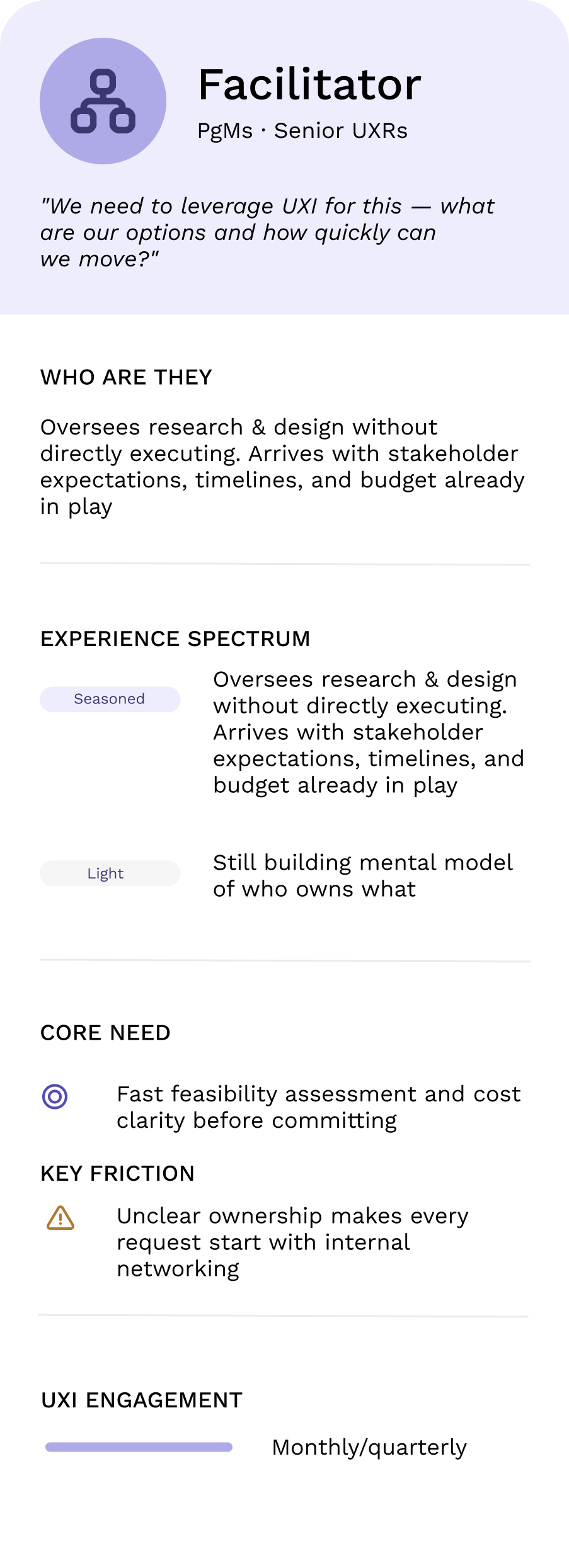
TL;DR: Facilitators manage the work without doing it. They come to UXI with budget and timeline pressure already locked in, and just need to know fast whether something is feasible and what it'll cost. Ownership ambiguity is their biggest blocker.
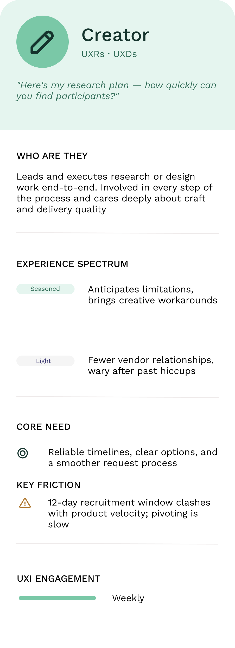
Creators are the practitioners doing the hands-on research and design. They're the most frequent UXI users and know the system reasonably well, but they're constantly fighting slow recruitment timelines against product velocity demands. Seasoned Creators work around it; Light Creators often give up.
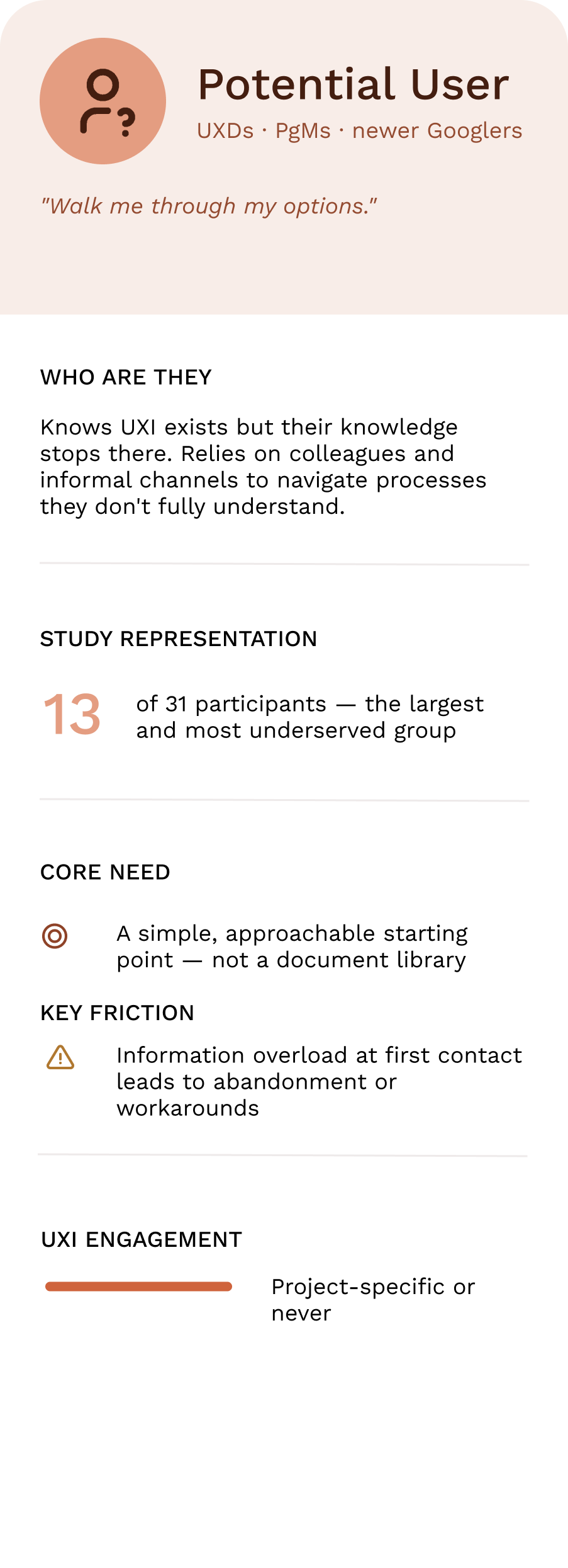
Potential Users are the biggest missed opportunity — the largest group in the study, yet the least served. They know UXI exists but can't figure out what it actually offers or how to get started. Complex materials and fragmented entry points push them toward informal workarounds or external agencies they don't realize UXI could replace.
The through-line: UXI was effectively designed for the Seasoned Creator and left everyone else to figure it out.
Design Solutions
What we built and why
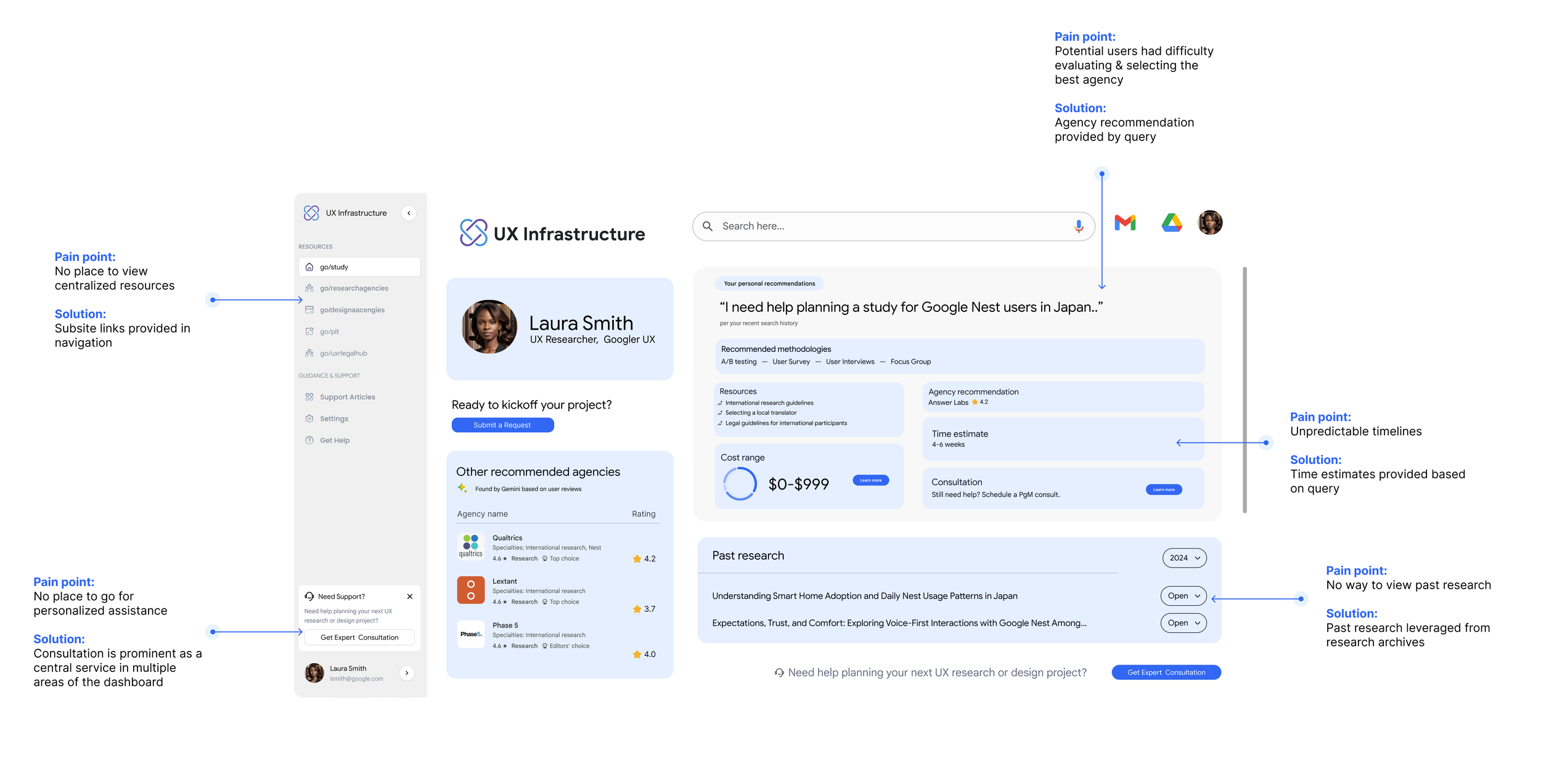
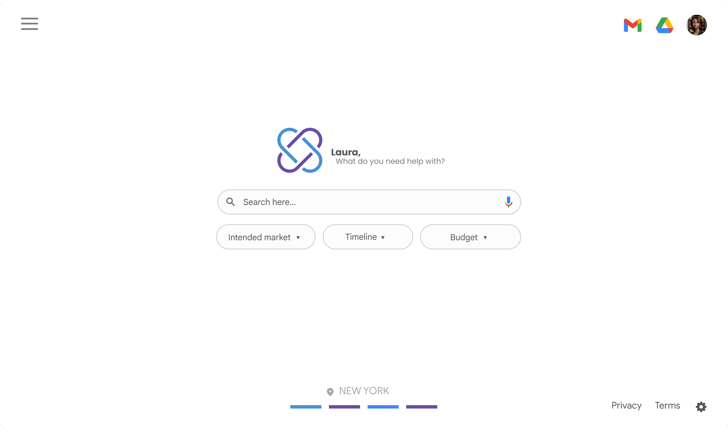
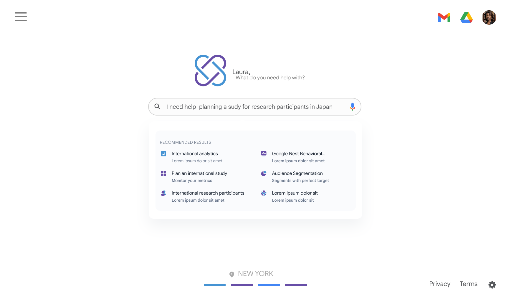
The redesigned UXI platform consolidates fragmented service entry points into a single, navigable dashboard.
Results & Impact
Where the project landed
What shipped
The redesigned UXI platform consolidates fragmented service entry points into a single, navigable dashboard — reducing disparate touchpoints by a projected 20%. The new information architecture is organized around how users think about their work, not how UXI has historically organized its teams.
Key improvements include:
A unified service discovery experience that presents options, timelines, and relevant context in one view
Streamlined consult flows that reduce the coordination overhead currently required to match users to the right service
Clearer ownership signals so users know immediately who can help and how to reach them
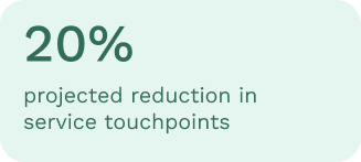
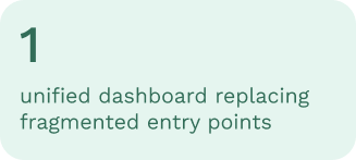
Consolidated service discovery into a single platform
UXI's fragmented entry points — each living at its own destination — were brought together into one navigable dashboard. Users can now find options, timelines, and next steps in a single view rather than navigating across disconnected surfaces.

Research validated the redesign direction
A mixed-methods study with 31 Googlers — spanning moderated interviews, card sorts, and journey mapping — surfaced the archetype framework and friction map that directly shaped design decisions. Structuring the work around real user needs gave the team a shared basis for prioritization throughout a short, lean sprint.
Delivered within a 3-month timeline
From foundational research through final designs, a lean team of three — UX Designer, UX Researcher, and Software Engineer — took the platform from discovery to a shippable solution, built on Google Material 3.