
Subscribe more, save more
Boosted adoption of Google Play Billing by promoting subscription benefits and incentivizing multi-service sign-ups.
My Role
UX Designer
Company/Team
Google — Monetization + Growth
Project Length
4 months
Collaborators
Product Manager
Software Engineer (DevOps)
UX Copywriter
UX Researcher
Design Direction
Google Material 3 Design System
The Challenge & Business Context
Subscriptions were Google Play's fastest-growing revenue model, and its most favorable, yet Play’s subscription were showing lower sign-up rates and higher churn on Play compared to competing platforms.
How might we increase subscription adoption on Google Play during key marketing moments, while meaningfully reducing the cost-driven churn that was eroding platform value?

User Pain Points
⨀ Cost was the #1 churn driver. Users regularly cited price, not content, as their reason for canceling after a free trial ended.
⨀ Subscription swapping was common. Users rotated services throughout the year based on content availability, indicating low platform loyalty.
⨀ Play's subscription benefits were invisible. Users weren't aware that subscribing through Google Play could offer meaningful advantages over third-party billing.
Scope
Three user entry points
App detail page banner, push notification on the home screen, and notification center, all targeting US users with at least one active paid subscription.
Campaign details page redesign
An eligible app carousel to reduce search friction and improve discovery of qualifying subscriptions, the primary UX design deliverable.
Fraud and abuse guardrails
Designing the program so that subscription tracking and reward mechanics minimized potential misuse without adding friction to legitimate users.
Hypothesis validation
Testing four risk areas — feasibility, usability, value, and viability — with a focus on whether discount incentives drive incremental sign-ups.
Research & Insights
TL;DR: Users aren't opposed to adding more subscriptions — but they need time, trust, and low stakes to do it. A one-month discount didn't clear that bar. They needed a better incentive. Free trials resonated more because they remove financial risk entirely, aligning with how users actually evaluate new services: try first, commit later.
During usability testing, we presented US-based participants with a prototype of the SMSM experience — a flow that surfaced featured subscription offers to existing Google Play subscribers and incentivized them to add a new service with a 10% discount. The goal was to validate whether the offer was compelling enough to drive incremental sign-ups and understand what, if anything, would get in the way.
Testing Personas
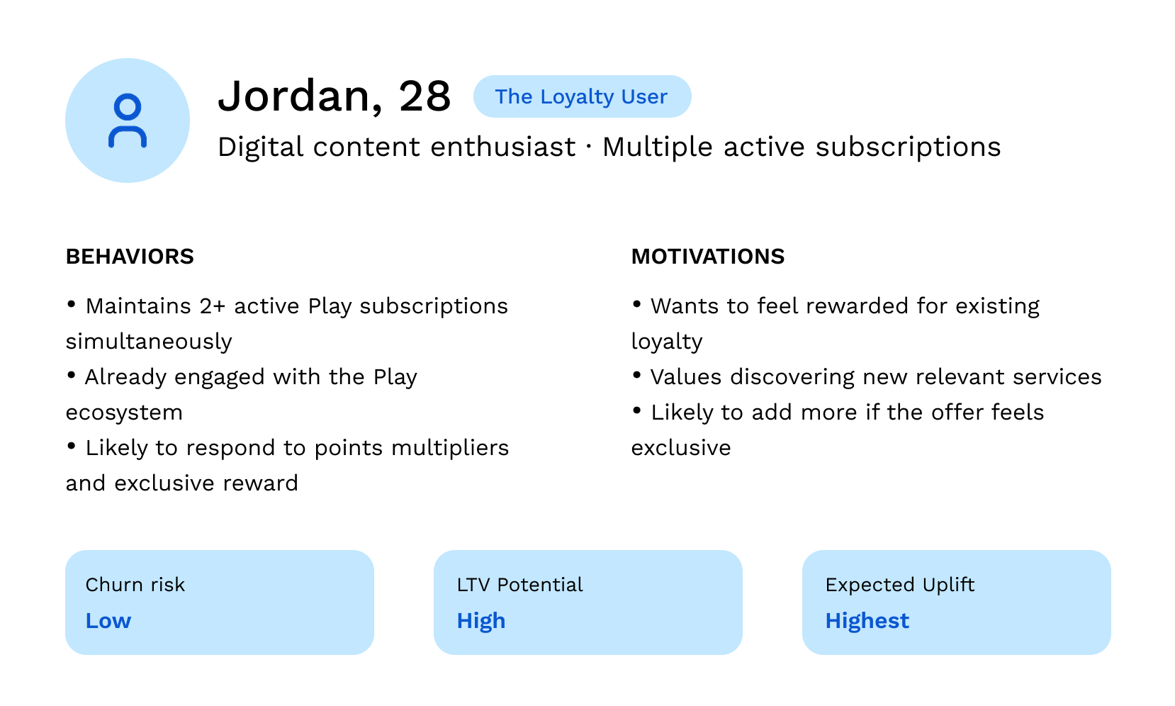
DESIGN PRIORITY
The highest-value segment. SMSM's discount tiers and carousel discovery were especially built to reward and further engage users like Jordan. The model assumed higher lift here and weighted the ARR estimate accordingly.
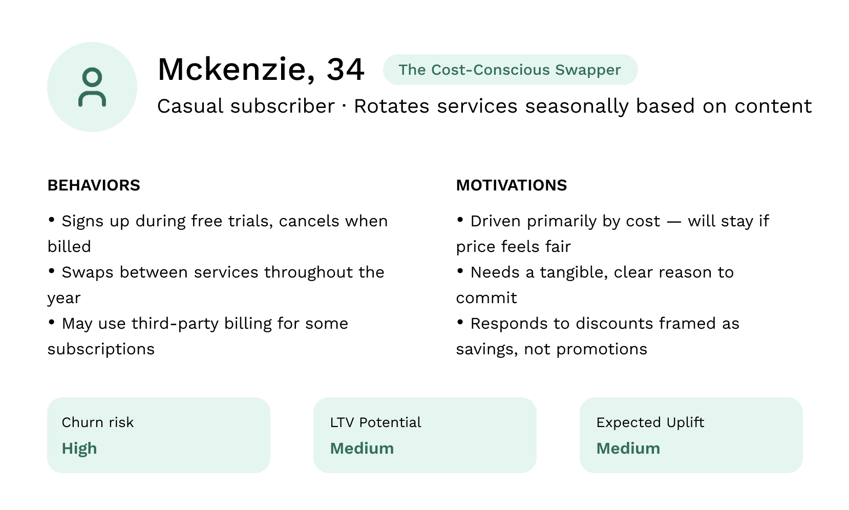
DESIGN PRIORITY
The core churn problem lives here. The program's proactive discount, offered before Riley cancels, not after, is the key intervention. The ROI model only works if Riley retains for 2+ months post-discount, making clear, trust-building copy and a frictionless sign-up flow critical.
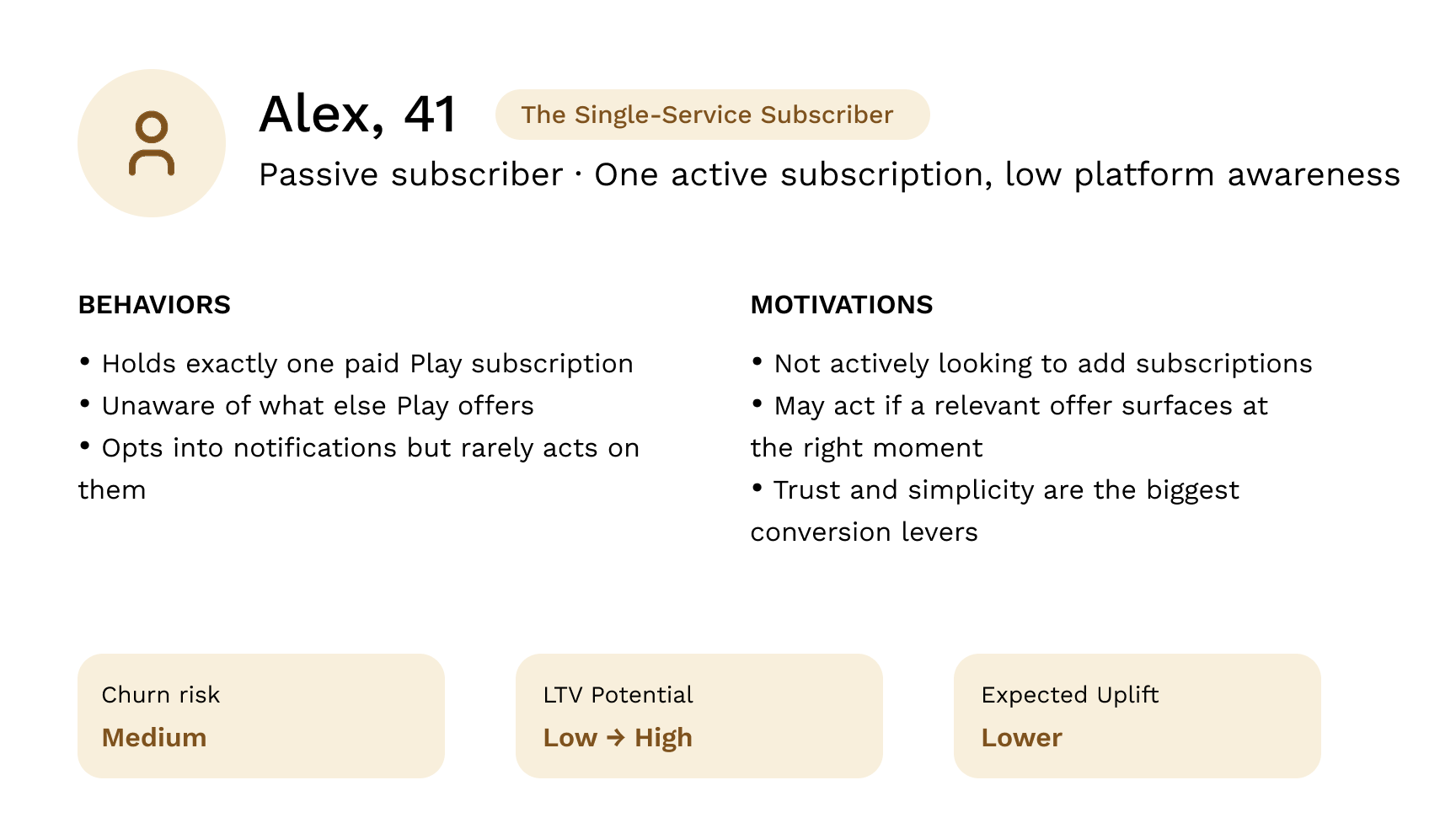
DESIGN PRIORITY
The long-tail growth opportunity. Alex is hard to convert but represents significant upside if activated — moving from one to two subscriptions roughly doubles their platform value. The app detail page banner and push notification are the primary touchpoints, making relevance and low friction non-negotiable.
Key Findings
⨀ Three distinct user types emerged
Usability testing revealed three behavioral profiles — the Loyalty User (multi-subscriber, high LTV), the Cost-Conscious Swapper (price-driven, high churn risk), and the Single-Service Subscriber (passive, low platform awareness) — each requiring a different design and messaging approach.
⨀ One month wasn't enough to move the needle
Users felt a one-month discount window was too short to meaningfully influence their decision to add a new subscription. The perceived benefit didn't outweigh the commitment, particularly for users already cautious about recurring costs.
⨀ Users preferred free trials over discounts
Most participants preferred a free trial offer over a discount incentive, often citing less financial commitment and a more transparent way to evaluate a new service before paying. A trial felt honest; a discount still felt like a sales push.
Design Solutions
What we built and why
The design centered on one core principle: reduce the effort between a user seeing the offer and acting on it. Every decision — from entry point to carousel — was made to lower friction and build trust at the moment of conversion.
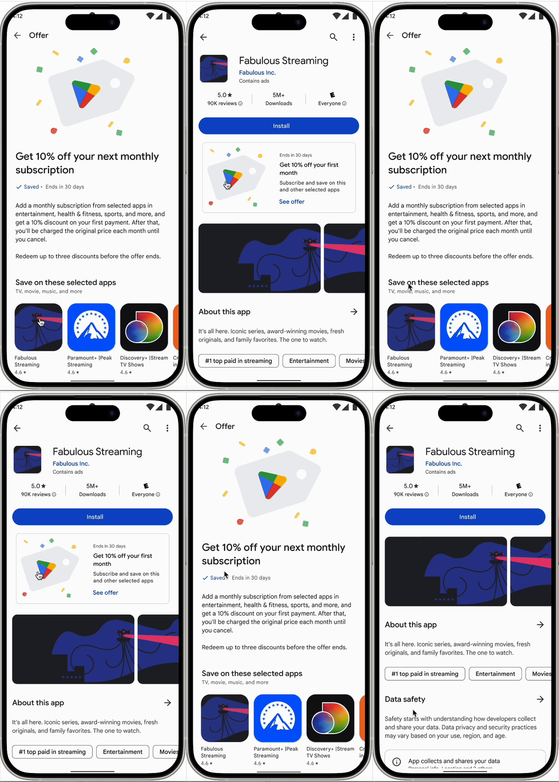
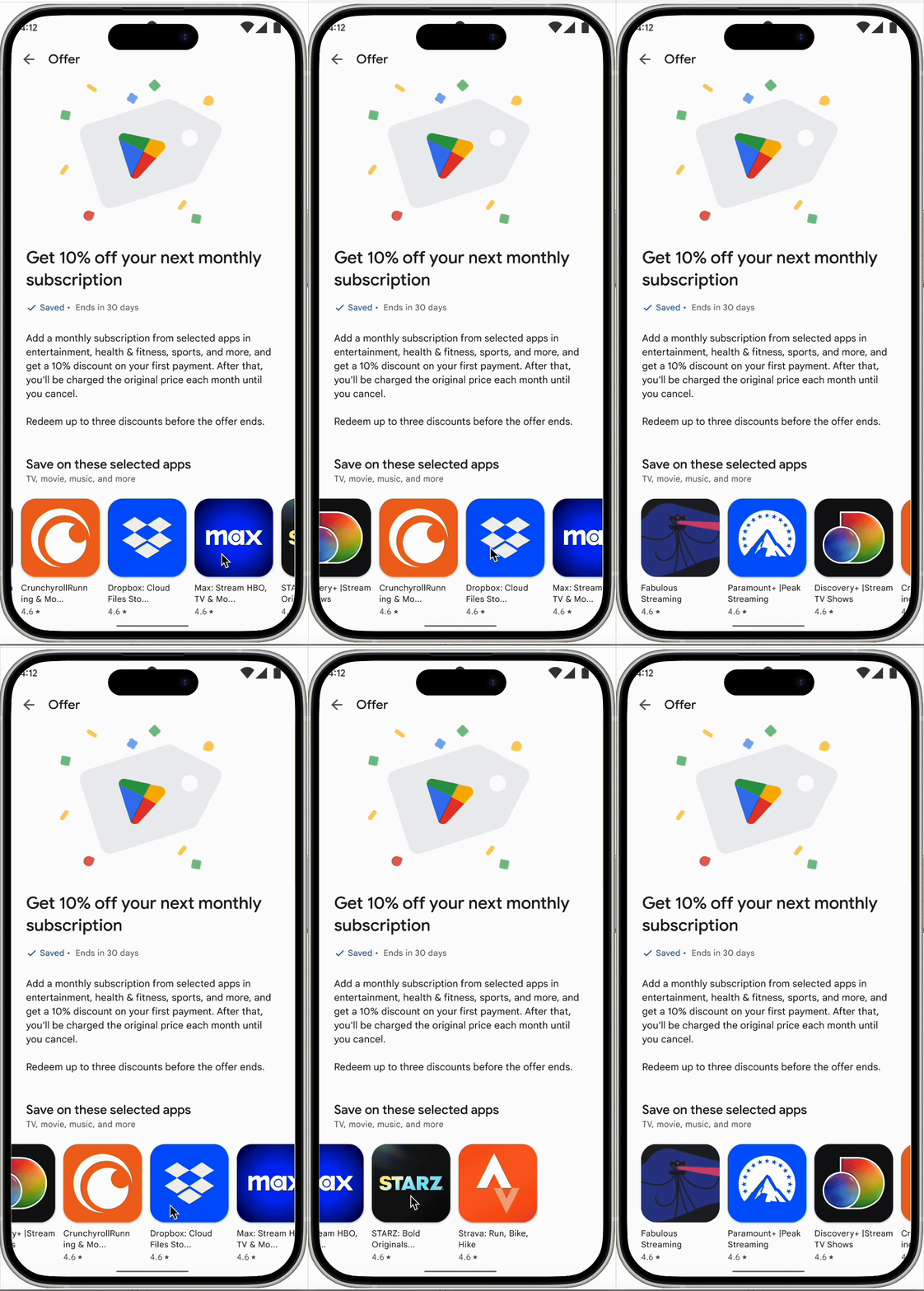
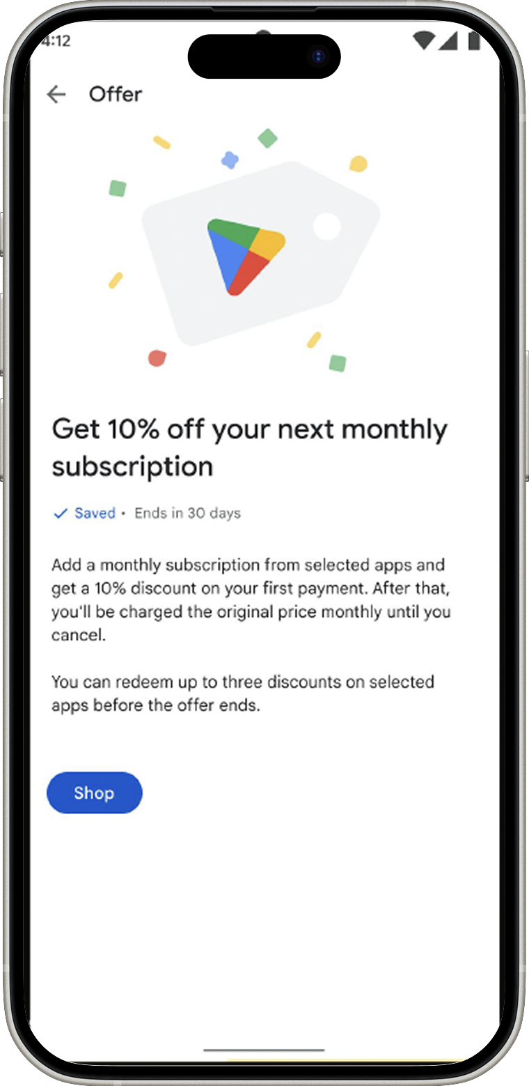
Adding an eligible app carousel to the campaign details page
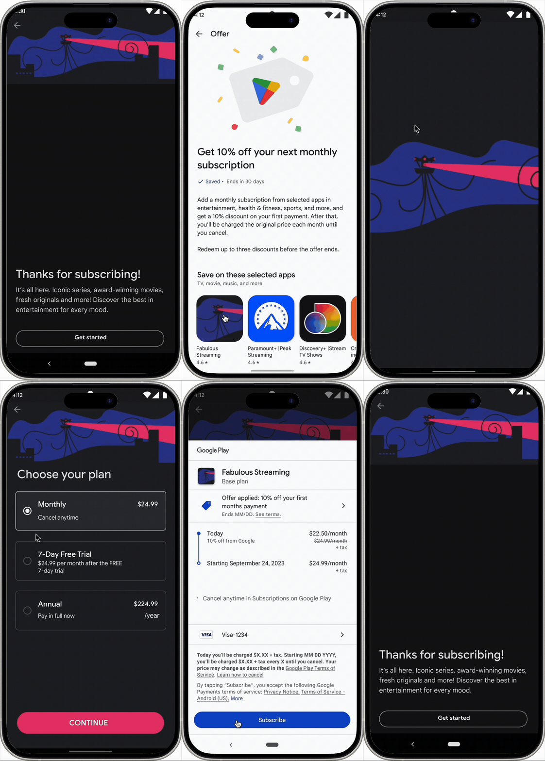
The previous design required users to manually search for qualifying apps after landing on the campaign page which was an unnecessary step that introduced friction right before conversion. The updated design replaced this with a browsable carousel of eligible apps, so users could discover and select a subscription without ever leaving the flow.


Surfaced contextually while a user was already browsing an app, the highest-intent moment to introduce the offer, since the user had already demonstrated interest in a service.
Target user was US users with at least one active and paid subscription.
App detail page banner
Entrypoint #1
Three entry points into the experience
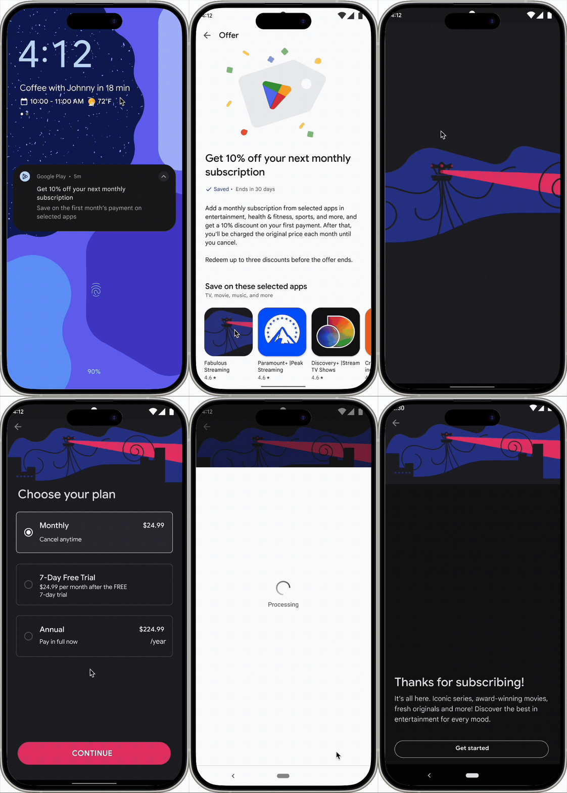
Entrypoint #2
Push Notifications
Delivered to the home screen for users opted into notifications, a proactive touchpoint designed to reach users outside of an active Play session, targeting the Cost-Conscious Swapper before churn occurs.
Target user - US users with at least one active and paid subscriptions that are opted into notifications.
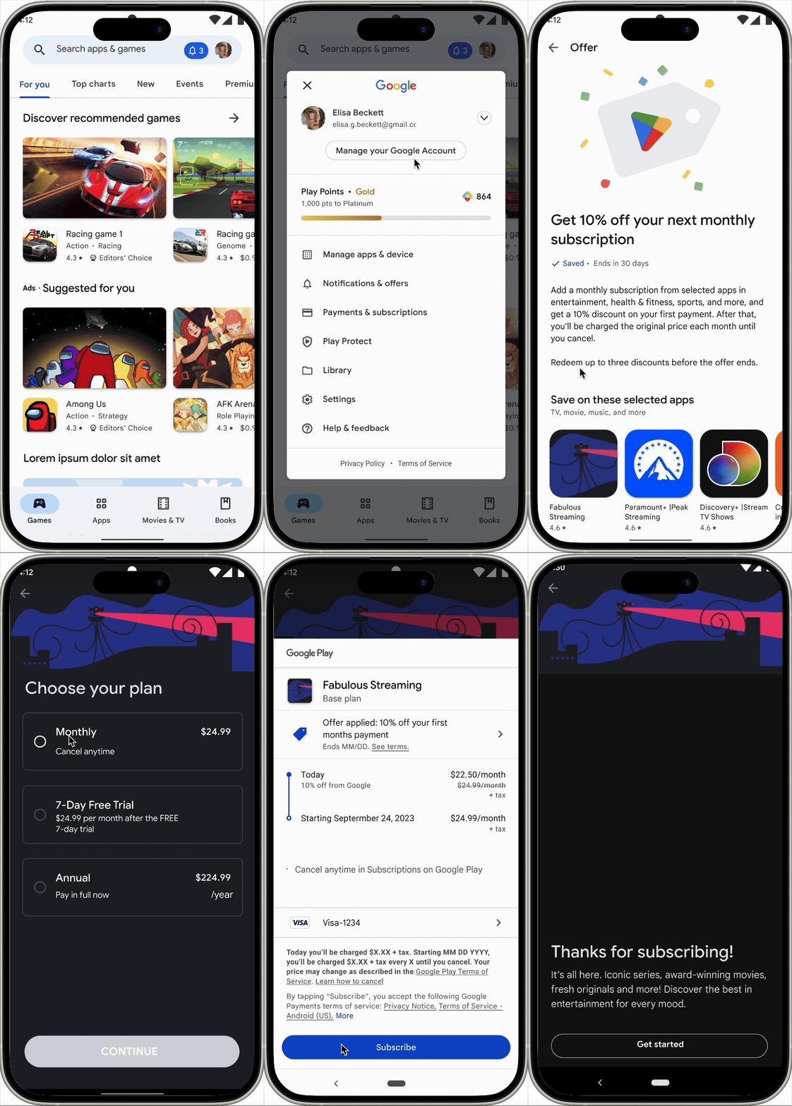
Entrypoint #3
A persistent entry point within Play for users who missed or dismissed the push notification, ensuring the offer remained accessible without being intrusive.
Notification Center
Results & Impact
Where the experiment landed
TLDR; The Subscribe More, Save More program shipped to 15% of active Google Play users in the US at the close of this project. Results from the controlled rollout are intended to directly inform whether — and at what scale — the program continues.
What shipped
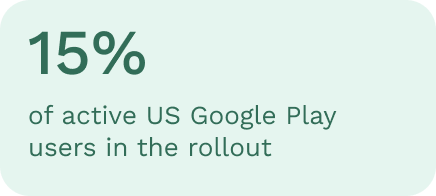
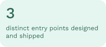
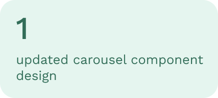
Shipped within a 4-month timeline
From background research and hypothesis framing through to a live experiment, delivered by a lean team of four across design, product, engineering, and copy.

Friction reduced at the critical drop-off point
The eligible app carousel replaced manual search on the campaign details page, directly addressing the usability risk identified in the P0 hypothesis framework, reducing the steps between intent and action.
Hypothesis framework validated as a design tool
Structuring the project around four risk areas — feasibility, usability, value, and viability — gave the team a shared language for prioritization and kept scope disciplined throughout a fast-moving experiment.